
When it comes to painting for internal walls, certain colours help create THE look. One such colour is white.
This can form a background colour for you and then additions or undertones and accents of your preferred colour. A blend of white, wood colour, and neutrals.
White allows other colours to pop out. It makes a room appear bigger than it is. It makes the lighting seem magnificent.
For those with impaired vision, you can turn off your lights if they are too bright and you can allow the walls to guide you at night time.
I know you will say, the white will easily get dirty, I know, teach yourself to stop touching the walls. There is nothing romantic there to having you lean or feel the wall or using it to scratch your back.
Also, teach and train your children to write on chalkboards or whiteboards or slates or whatever fancy thing they can write on but NEVER on the wall.
Another thing you can do is to use white oil paints as opposed to emulsion paints. Usually, textured paints are rough, and I wouldn’t dream of scratching my back across that surface.
Oil paint creates a film-like coating that doesn’t absolve water unlike emulsion/textured, so you can easily wipe off dirt with a damp cloth, NOT WASHING.
Read Building Construction Cost Influencers You should keep in mind.
You may wash off the paint and expose the plaster which will make your interior look dirty.
Keep this in mind when choosing your next painting scheme. I personally do not like plain walls with nothing on it. No Artwork or patterns or Picture frames or furniture.
Just plain boring walls. The only plain walls I allow are walls along transits.
Even such walls can be played with without creating any obstacles along the pathways. Create some paintings or murals along those walls. Could be a spatter of colours. You would be amazed at how that simple design can transform your space and the ambiance of the room.
NO paper-flowered wallpaper like we did in our hostels at the University.
Wallpaper has class.
I love the purple colour but there is a way to use it in interiors. Out of peer pressure to be like a typical girl, I did my apartment all through with lilac. They said I was always using mature people’s colours and people wouldn’t know it was a lady’s house.
It was nice and plain and then finding colours that matched… Wahala. I splashed red, yellow, and blue to reduce the monotone and right now, I just simply look forward to my own house.
Read Laterite and Clay: Your best block wall for Sustainability.
What colour patterns and designs have you tried?
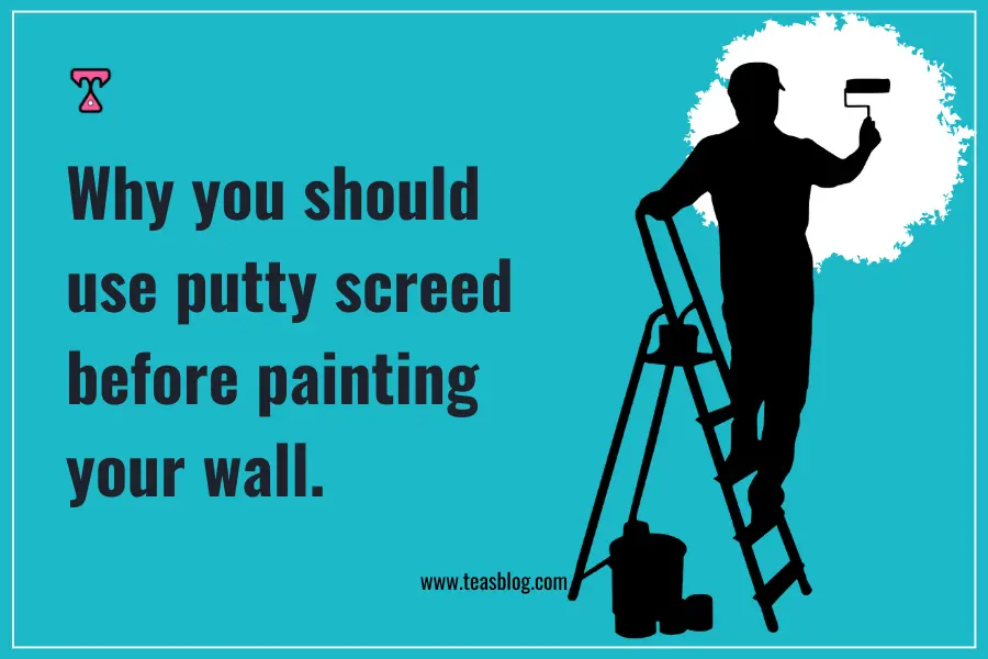
Why you should use putty screed before painting your wall.
There is a plaster-like material called “Putty screed”.
It’s white in colour.
Remember when I said white allows your other preferred colours to pop out? This is another way white shows itself.
It is used to fill up holes on a plasterwork surface before the actual painting is done.
That plastering is porous, it allows the paint to be absorbed into the walls and that’s why you paint 2 or 3 times for your colours to pop out and even at that, your lighting still looks dull.
The difference is made with a putty screed (unless your colour is within the darker shade of the colour spectrum).
It’s quite expensive, I know, but it’s also your interior, your space, your house, your home.
Contact us for assistance.